
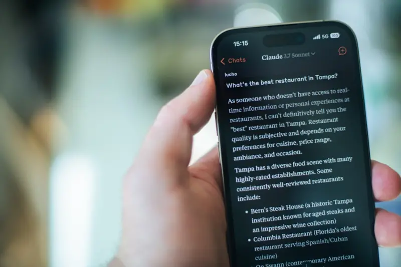
Mobile search isn’t a side‑project anymore—it’s the main stage. While the rest of the SEO world has been busy fine‑tuning link‑building strategies, content clusters, and AI‑generated snippets, the reality on the ground is that the majority of SaaS buyers are taking their first, and often only, interaction with your brand on a smartphone. If your mobile experience is clunky, slow, or simply invisible to Google’s mobile‑first index, you’re handing those prospects to a competitor with a single swipe.
Why Mobile SEO Is the New Competitive Battlefield
Google’s mobile‑first indexing means that the crawler primarily looks at the mobile version of your site to determine rankings. That shift has a cascade of implications:
- Page speed is now a direct ranking factor, not just a UX nicety.
- Core Web Vitals (LCP, FID, CLS) are measured on mobile devices, so a desktop‑optimized site can still be penalized.
- Rich results are displayed differently on small screens, affecting click‑through rates dramatically.
- Local intent spikes on mobile, but we’ve already covered local SEO in another post, so this piece will focus on the technical and strategic layers that make mobile work for SaaS.
1. Adopt a True Mobile‑First Architecture, Not Just a Responsive Layout
Responsive design is a good start, but it’s often a superficial layer slapped on a desktop‑centric codebase. A true mobile‑first architecture means serving lightweight HTML, deferring non‑essential JavaScript, and delivering images in next‑gen formats (AVIF, WebP) right from the first request.
When you have a SaaS product with heavy JavaScript interactions—dashboards, real‑time analytics, or drag‑and‑drop builders—those scripts can cripple mobile performance. The JavaScript‑heavy SaaS sites on mobile article walks through progressive enhancement tactics that let you keep the rich UI for desktop while serving a lean, functional version to mobile browsers.
Key steps:
- Server‑side rendering (SSR) for critical content, so the first paint contains the most important information without waiting for JS execution.
- Code splitting to load only the JS needed for the viewport.
- Lazy‑load images and iframes using native
loading="lazy"and intersection observers. - Eliminate render‑blocking CSS by inlining above‑the‑fold styles and loading the rest asynchronously.
2. Core Web Vitals: The Mobile‑Centric Health Check
Google’s Core Web Vitals are broken down into three metrics:
- Largest Contentful Paint (LCP) – the time it takes for the main content to appear. Aim for under 2.5 seconds on mobile.
- First Input Delay (FID) – the delay before a user can interact. Target under 100 ms.
- Cumulative Layout Shift (CLS) – visual stability. Keep it below 0.1.
To diagnose issues, use Chrome DevTools’ “Performance” panel, the Lighthouse audit, or the Web Vitals Chrome Extension. Remember, the mobile network simulation (e.g., “Fast 3G”) is crucial; a page that scores well on a desktop 5 G connection may still flop on a typical 4G handset.
Practical fixes:
- Serve compressed, cache‑friendly assets using Brotli or GZIP.
- Implement preconnect for third‑party domains (fonts, analytics) to shave off latency.
- Use font-display: swap to avoid invisible text while fonts load.
- Audit third‑party scripts—each additional tag can add 300 ms to LCP.
3. Structured Data Is Not Just for Desktop Snippets
Search engines increasingly surface rich results on mobile SERPs—think FAQs, How‑Tos, and product schema. When you tailor your structured data for the mobile context, you increase the likelihood of appearing in the coveted “Zero‑Click” space where users get answers without ever clicking through.
For SaaS, FAQ schema is a low‑effort win. Pair that with the Structured data for mobile FAQs guide to ensure you’re using the right types (FAQPage, HowTo) and that the markup is placed in the mobile HTML, not just the desktop version.
Don’t forget to validate your JSON‑LD with Google’s Rich Results Test and keep an eye on the “Coverage” report in Search Console for mobile‑specific indexing errors.
4. Leverage Zero‑Click SERP Features on Mobile
Mobile users love instant answers. Whether it’s a featured snippet, a Knowledge Panel, or a carousel, these placements dominate the limited screen real estate. The Zero‑Click SERP features for mobile article explains how to craft content that directly answers the “who, what, when, where, why, how” questions that Google loves to surface.
Actionable tactics:
- Answer first—lead with a concise 40‑word answer before the deep dive.
- Use bullet points and tables—these formats are more likely to be lifted as snippets.
- Target “People also ask” (PAA) by creating linked sub‑questions within your pillar content.
- Optimize for voice search—mobile voice queries often trigger featured snippets.
5. Mobile‑First Content Strategy: Short, Scannable, Actionable
On a 5‑inch screen, users skim. Your copy must be bite‑size but still convey enough value to move a prospect down the funnel. Adopt the “mobile‑first content hierarchy”: headline → sub‑headline → three‑sentence intro → bullet‑point benefits → CTA.
Combine this with visual hierarchy: large, legible fonts (minimum 16 px), ample line‑height, and a generous touch target size (44 px minimum). When users can easily tap a CTA, your conversion rate lifts dramatically.
6. Progressive Web Apps (PWAs) as a Bridge Between Web and Native
For SaaS products that need deep interactivity—think a CRM dashboard or a BI tool—consider a PWA. A PWA gives you the speed and offline capabilities of a native app while staying indexable by Google. The service worker can cache critical assets, dramatically reducing LCP on repeat visits.
Key benefits:
- App‑like experience without the friction of App Store approvals.
- Push notifications to re‑engage users on mobile.
- Improved SEO because the HTML shell remains crawlable.
Just be careful to serve a clean, crawlable index.html for Googlebot, and use manifest.json to declare your PWA’s metadata.
7. Image Optimization for the Mobile Eye
Images are often the single biggest culprit in mobile bloat. Follow these steps:
- Resize images to the exact dimensions needed on mobile. No “hero” image that’s 2000 px wide on a 360 px screen.
- Convert to WebP or AVIF. Chrome and Safari both support these formats now.
- Implement responsive
srcsetto serve the appropriate size based on device pixel ratio. - Consider lazy‑loading for images below the fold.
8. International Mobile SEO: Geo‑Targeting on the Go
If your SaaS serves a global audience, mobile users often search with “near me” or location‑specific intent. Use hreflang annotations on your mobile pages and ensure that each language version has its own mobile URL (e.g., example.com/fr/mobile) rather than relying on JavaScript redirects that can confuse crawlers.
9. The Role of Mobile Site Search in SaaS Conversions
Many SaaS websites embed a site‑wide search box. On mobile, a hidden or poorly‑implemented search can be a conversion killer. Optimize it by:
- Keeping the input field always visible at the top of the page.
- Providing instant, type‑ahead suggestions that are mobile‑friendly.
- Ensuring search results are rendered server‑side for quick load.
10. Monitoring and Continuous Improvement
Mobile SEO isn’t a one‑off checklist—it’s an ongoing process. Set up a monitoring stack:
- Google Search Console – Mobile Usability report.
- PageSpeed Insights API – Pull LCP, FID, CLS data daily.
- Log file analysis – Identify crawl budget waste on heavy mobile resources.
- Heatmap tools (Hotjar, FullStory) – Observe tap patterns and friction points.
Whenever you notice a dip in any Core Web Vital, prioritize it in your sprint backlog. Treat mobile performance as a non‑negotiable sprint goal, just like security or bug fixes.
Putting It All Together: A Mobile SEO Playbook for SaaS Leaders
1️⃣ Audit your mobile site with Lighthouse and Search Console.
2️⃣ Prioritize fixes that impact Core Web Vitals the most—usually render‑blocking resources and large images.
3️⃣ Implement structured data tailored for mobile SERP features.
4️⃣ Optimize content for quick scanning and voice queries.
5️⃣ Iterate on a weekly cadence, measuring the impact on rankings, CTR, and ultimately, qualified leads.
When you treat mobile as the primary entry point—not an afterthought—you’ll see higher organic visibility, lower bounce rates, and a smoother path from search to trial. In the SaaS world where the sales cycle is already compressed, every second of load time you shave off can translate into a tangible revenue lift.
Remember: the mobile web is a living organism. As browsers evolve, new standards (like Core Web Vitals 2.0) will emerge. Stay curious, stay data‑driven, and let your mobile users be the ultimate proof of your SEO success.

Paula Wright writes from her home in Toronto Ontario, where she lives with her husband, Steve, and their two children. Driven by curiosity and a passion for storytelling, Paula loves to uncover the "why" and "how" behind every topic she covers. Her writing is fueled by her adventures; when she’s not at her desk, you’ll find her out on the road, camping under the stars, or wandering a new trail. Paula brings a sense of discovery and a fresh, real-world perspective to everything she writes for us.
Related Posts

Mobile SEO Mastery: Turning Tiny Screens into Trust Engines
Learn why mobile‑first SEO matters, how to optimize speed, structured data, and crawl budget, and ... Read More

Mobile Intent Mapping: The New Secret Sauce for SaaS SEO
Discover a fresh mobile SEO strategy that goes beyond speed and responsiveness. By mapping user inte... Read More

Mastering Mobile SEO: Empathy‑First Strategies for Real‑World Rankings
A deep dive into empathy‑first mobile SEO, covering responsive design, speed, local voice search, ... Read More
Top Posts

Why SERP Volatility Is the Real KPI SaaS Marketers Should Track
SERP volatility isn’t a bug—it’s a feature of modern search. Learn why SaaS marketers should make volatility a key KPI and how to monitor, analyze, and ac...Read More

Riding the Social Strategy Wave: Insights from William Roy for 2024
William Roy shares a 2024 social strategy roadmap that balances authentic community building, data‑driven storytelling, and future‑proof tactics for lasting...Read More

Tuning In: How Social Audio Is Redefining Brand Engagement
Social audio is turning the marketing playbook upside down. Learn why voice‑first conversations are the next big win for brands and how to harness them for au...Read More

Maximizing Your Social Media Presence: Strategies for Success
Learn how to create a successful social media strategy that drives engagement and success for your brand. Get tips on content creation, influencer marketing, an...Read More
0 Comments
Post Comment
You will need to Login or Register to comment on this post!