

Why Mobile Site Architecture Matters More Than Ever
When Google’s mobile‑first indexing took center stage, the underlying structure of your site became the silent engine driving visibility on small screens. A well‑thought‑out hierarchy not only guides users through a frictionless journey but also signals to crawlers which pages deserve priority in the limited mobile crawl budget. Strategic navigation paths reduce bounce rates, keep dwell time high, and ultimately influence rankings in ways that pure content optimization can’t achieve. Think of your mobile architecture as a roadmap that must be both human‑friendly and bot‑readable, balancing aesthetic simplicity with technical depth.
Streamlined Navigation: The Mobile‑First Blueprint
On a smartphone, every tap counts; a cluttered menu can turn a potential conversion into a lost opportunity within seconds. Prioritize a “hamburger” or bottom navigation that surfaces the top three to five primary sections, ensuring that core pages are reachable within two clicks from any entry point. Use descriptive, concise labels that resonate with on‑the‑go users—avoid jargon that might confuse or delay. By trimming the navigation tree, you also lighten the page’s HTML weight, giving Google’s mobile crawler a cleaner signal to follow.
Internal Linking Strategies Tailored for Mobile
Internal links act as the veins of your site, delivering “link juice” and contextual relevance to every corner of your mobile ecosystem. Instead of dumping dozens of links in a footer, embed contextual anchors within the body content where they naturally belong, using descriptive anchor text that reflects user intent on mobile. For example, a product page can link to a concise new SERP features guide that explains how rich snippets appear on handheld devices. Limit the total number of links per page to a reasonable amount—typically 50 or fewer—to preserve crawl efficiency and prevent dilution of ranking power.
URL Structure: Keeping It Short, Sweet, and Scannable
Mobile users scan URLs in the address bar or share links via messaging apps, so brevity and clarity are essential. Adopt a flat hierarchy where possible, reducing the number of sub‑folders and parameters that can confuse both users and search bots. A clean URL like example.com/organic‑smoothies conveys immediate relevance, whereas example.com/category/food/recipes/2024/organic‑smoothies adds unnecessary depth. Consistent, keyword‑rich slugs also reinforce topical authority, especially when paired with logical breadcrumb trails that adapt gracefully to narrow screens.
Schema Markup Optimized for Mobile SERPs
Structured data isn’t just for desktop; it can dramatically enhance your mobile search presence by enabling rich results that fit tiny screens. Implement MobileApp and WebPage schema to inform Google about app availability, AMP versions, or interactive elements like carousels that render better on phones. When done correctly, these snippets can replace a traditional text link with a clickable button or icon, boosting CTR without sacrificing page load speed. Remember to test your markup with Google’s Rich Results Test to ensure it renders flawlessly on both Android and iOS devices.
Balancing Page Speed with Feature‑Rich Design
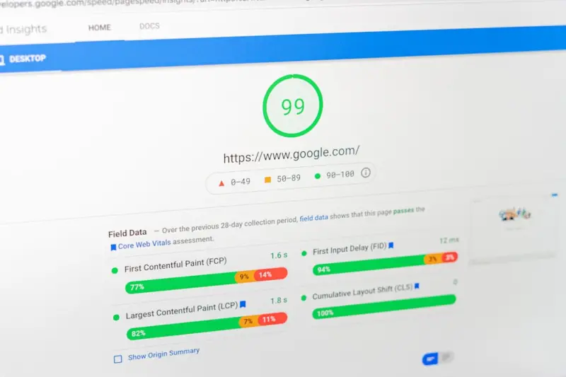
Performance remains a cornerstone of mobile SEO, yet designers often feel pressured to add eye‑catching animations that slow down load times. The key is to adopt a progressive enhancement mindset: serve a lightweight core experience first, then layer in non‑essential visual flourishes using asynchronous loading techniques. Tools like mobile performance tactics can guide you in compressing images, leveraging browser caching, and prioritizing critical CSS. A sub‑second First Contentful Paint (FCP) not only satisfies impatient users but also aligns with Google’s Core Web Vitals thresholds for mobile ranking.
Optimizing Crawl Budget for Mobile‑Only Pages
Google allocates a finite amount of crawl resources to each domain, and mobile‑only pages often compete with their desktop counterparts for attention. To protect your crawl budget, use the robots.txt file to block low‑value URLs, such as duplicate printer‑friendly pages or staging environments, from mobile crawlers. Additionally, implement canonical tags that point to the primary mobile version, avoiding split‑page penalties. By consolidating signal strength into your most important mobile assets, you ensure that Google indexes and ranks the pages that truly drive traffic and conversions.
Testing and Monitoring: Mobile‑First Audits That Drive Results
Regular audits are the only way to guarantee that your mobile architecture stays aligned with evolving algorithmic preferences. Use Google Search Console’s Mobile Usability report to spot indexing errors, viewport misconfigurations, or touch‑element spacing issues that could hinder user interaction. Pair this with Lighthouse or PageSpeed Insights to measure Core Web Vitals specific to mobile, then iterate based on data‑driven insights. A disciplined testing routine, combined with quick fixes, creates a feedback loop that continuously lifts both user experience and search visibility.
Future‑Proofing Your Mobile Site: Preparing for Voice and Visual Search
As voice assistants and visual search become mainstream, the structural foundation you build today will dictate how easily your content adapts to these new entry points. Design your navigation to accommodate natural‑language queries—think “find me a gluten‑free dessert near me” rather than “desserts → gluten‑free”. Include descriptive alt text and structured data for images so visual search engines can index your media assets accurately. By embedding these forward‑thinking practices into your mobile architecture now, you position your site to capture emerging traffic streams before competitors catch up.

Tammy French is a Montessori Teaching Assistant and freelance writer passionate about education, creativity, and inspiring lifelong learning through engaging content.
Related Posts

Mobile‑First Architecture: Building a Mobile‑Centric Site for SERP Dominance
Learn the essential steps to shift your site to a mobile‑first architecture, from navigation and s... Read More

Mobile SEO: The Key to Unlocking Your Website's Full Potential
Mobile SEO is crucial for your website's success. Learn why and how to optimize for the small screen... Read More

5G Mobile SEO: Speed, Relevance & Authority
In a world racing toward 5G, mobile SEO must evolve. I share insider tactics—from adaptive content... Read More
Top Posts
Winning the Personalized SERP: How to Tailor Your Content for Each Searcher
Learn why SERPs are now uniquely tailored to each searcher and get actionable tactics—schema, content clusters, and personalized metrics—to stay on top acro...Read More

Mobile‑First Indexing: The SaaS SEO Edge
A deep dive into mobile‑first indexing for SaaS, covering Core Web Vitals, PWAs, schema markup, thumb‑friendly design, and a practical checklist to turn mob...Read More

The Quiet Engine of Mobile Voice Search: A SaaS Growth Playbook
Learn how to capture the booming mobile voice search market with a step‑by‑step playbook that turns conversational queries into rankings, using answer‑fir...Read More

Mastering Crawl Budget: A Technical SEO Blueprint for Large Sites
A step‑by‑step technical SEO guide to mastering crawl budget, cleaning response codes, and using modern protocols for faster, more efficient indexing....Read More
0 Comments
Post Comment
You will need to Login or Register to comment on this post!