

Why Mobile SEO Is No Longer Optional
When I first started optimizing sites for search, the desktop was king and mobile was an afterthought. Fast‑forward to 2024, and the reality is starkly different: mobile traffic now accounts for over 60% of global web usage, and Google’s mobile‑first indexing means that your site’s mobile version is the primary source for ranking decisions. As a marketer who spends her mornings scrolling on a phone while sipping coffee, I’ve felt the pressure to make every pixel count. The stakes are higher because users expect instant, frictionless experiences, and any hiccup—slow load times, awkward navigation, or unreadable text—can send them straight to a competitor. This shift isn’t just a technical tweak; it’s a fundamental change in how we think about content strategy, user intent, and even brand perception. In this post, I’ll walk you through the most critical mobile SEO tactics that have helped my clients climb the SERPs, and I’ll share the nuanced lessons I’ve learned while balancing speed, design, and search visibility.
Understanding Mobile‑First Indexing and Its Implications
Google’s mobile‑first indexing policy means that the search engine crawls and indexes the mobile version of your site before looking at the desktop counterpart. If your mobile site is missing essential content, structured data, or has broken links, Google will treat those gaps as deficiencies in the overall site. I’ve seen cases where a brand’s desktop site was immaculate, but the mobile version lacked canonical tags, resulting in duplicate content warnings and a dramatic drop in rankings. The key is to ensure parity between mobile and desktop: identical title tags, meta descriptions, and primary content should be present on both, even if the layout differs. Use tools like Google Search Console’s Mobile Usability report to spot issues early, and conduct regular audits to verify that your mobile pages render correctly across a variety of devices and screen sizes. Remember, the algorithm doesn’t care how pretty your desktop site is if the mobile experience is subpar.
Crushing Page Speed: Core Web Vitals for Mobile
Speed is the lifeblood of mobile SEO, and Google’s Core Web Vitals—Largest Contentful Paint (LCP), First Input Delay (FID), and Cumulative Layout Shift (CLS)—are now ranking signals. In my experience, a one‑second improvement in LCP can boost engagement metrics by up to 15%, which in turn sends positive signals to Google. To achieve this, start by compressing images using next‑gen formats like WebP, and serve them via a Content Delivery Network (CDN) to reduce latency. Minify CSS and JavaScript, and defer non‑essential scripts to avoid blocking the main thread. Lazy‑load below‑the‑fold content so users see above‑the‑fold elements instantly. Tools such as PageSpeed Insights and Lighthouse give you a clear roadmap for optimization. A quick win is to enable HTTP/2, which allows multiplexing of requests and dramatically cuts load times on mobile networks. Consistently monitor your metrics; even minor regressions can cascade into lower rankings and higher bounce rates.
Responsive Design vs. Dynamic Serving: Choosing the Right Approach
One of the biggest decisions I’ve faced with clients is whether to go with a fully responsive design or a dynamic serving setup. Responsive design uses CSS media queries to adapt a single HTML page to any screen size, which simplifies maintenance and ensures content consistency. However, for highly complex e‑commerce sites with massive product catalogs, dynamic serving—delivering different HTML based on the user‑agent—can offer performance benefits if implemented correctly. In my recent project, we evaluated the trade‑offs by consulting Kelly Reynolds’ 2024 SEO Playbook, which highlighted that responsive designs generally outperform dynamic serving in Google’s eyes, provided the CSS is clean and the HTML isn’t bloated. If you opt for dynamic serving, be meticulous with Vary: User‑Agent headers and test every variant in Search Console. The safest bet for most brands is a mobile‑first responsive framework that prioritizes speed, accessibility, and a unified content strategy.
Mobile User Experience Signals That Influence Rankings
Beyond technical metrics, Google now incorporates real‑world user experience signals from mobile devices into its ranking algorithm. Dwell time, pogo‑sticking, and click‑through rates are all amplified on smartphones because users are more impatient and often on the go. To keep visitors engaged, focus on clear, concise copy that fits comfortably on small screens. Use large, tappable buttons with ample whitespace to reduce accidental clicks. Voice search is also gaining traction; crafting conversational content that answers “who,” “what,” “where,” and “how” questions can capture featured snippets on mobile SERPs. I recommend implementing progressive web app (PWA) features like offline support and push notifications for repeat visits, but only if they enhance the user journey rather than add clutter. Regularly review your mobile analytics to identify high‑bounce pages and iterate on layout, copy, or load speed to improve those critical UX signals.
Leveraging Structured Data for Mobile SERP Visibility
Structured data isn’t just for desktop; it’s a powerful tool to boost mobile visibility, especially for rich results like FAQs, how‑to guides, and product carousels that appear prominently on small screens. By adding JSON‑LD schema markup, you help Google understand the context of your content, increasing the chance of appearing in voice‑search answers and mobile‑first featured snippets. In a recent audit, I integrated The SERP Revolution insights to prioritize schema types that perform best on mobile, such as “MobileApp” and “LocalBusiness.” Test your markup with the Rich Results Test tool, and monitor the “Enhancements” report in Search Console to track impressions and clicks. Remember, over‑optimizing or using irrelevant schema can lead to manual penalties, so keep your markup accurate, concise, and directly related to the page’s primary content.
Local Mobile SEO: Capturing the “Near Me” Crowd
Local searches are overwhelmingly mobile—over 70% of “near me” queries happen on smartphones. Optimizing for local mobile SEO means ensuring your Google Business Profile is complete, accurate, and regularly updated with photos, posts, and Q&A. Mobile users also expect immediate access to contact information, so embed click‑to‑call buttons and map snippets directly into your site’s header. I’ve helped brick‑and‑mortar clients boost foot traffic by 30% by leveraging localized schema markup and creating mobile‑optimized landing pages that load in under two seconds. For deeper strategic guidance, refer to Mastering 2024 SEO, which outlines how to combine citation consistency, localized content clusters, and mobile‑first technical SEO to dominate local SERPs. Don’t forget to encourage satisfied customers to leave reviews; positive ratings are a strong ranking factor for mobile local searches.
Sustainable Mobile Link Building Strategies
Link building remains a cornerstone of SEO, but mobile‑first sites require a nuanced approach. Traditional outreach that focuses solely on desktop‑centric publications often misses the audience that primarily consumes content on mobile. To attract high‑quality mobile backlinks, create shareable assets such as mobile‑optimized infographics, short video tutorials, and interactive calculators that load instantly on smartphones. Promote these assets through mobile‑friendly channels like Instagram Stories and TikTok, where influencers can embed links back to your site. I also recommend collaborating with app developers to include deep links within their mobile applications, driving referral traffic that Google recognizes as authoritative. Ensure that every external link you acquire points to a page that meets mobile performance standards; otherwise, the link’s value diminishes. Regularly audit your backlink profile for mobile relevance and disavow any spammy links that could harm both desktop and mobile rankings.
Looking Ahead: The Future of Mobile SEO in 2025 and Beyond
As we near the end of 2024, the trajectory of mobile SEO points toward even tighter integration with AI, augmented reality, and immersive experiences. Search engines are experimenting with visual search that interprets images captured on phones, meaning that optimizing alt text and image context will become more critical than ever. Additionally, the rise of 5G will shrink latency concerns, allowing for richer, more interactive mobile pages without sacrificing speed. My advice for staying ahead is to adopt a mindset of continuous experimentation: A/B test mobile layouts, monitor emerging Core Web Vitals updates, and invest in headless CMS architectures that deliver content instantly across devices. By aligning your strategy with the evolving mobile ecosystem and keeping user experience at the forefront, you’ll not only protect your rankings but also capture the next wave of mobile‑first users eager for fast, relevant, and engaging content. Stay curious, stay agile, and let mobile be the engine that drives your SEO success.

Jessica Hall is a dynamic freelance writer based in the vibrant city of London, Ontario. As a dedicated single mom, she expertly juggles the demands of parenthood with her passion for storytelling, crafting compelling narratives that resonate with readers. With a background in retail, Jessica brings a unique perspective to her writing, infusing her work with insights drawn from her experiences.
Related Posts
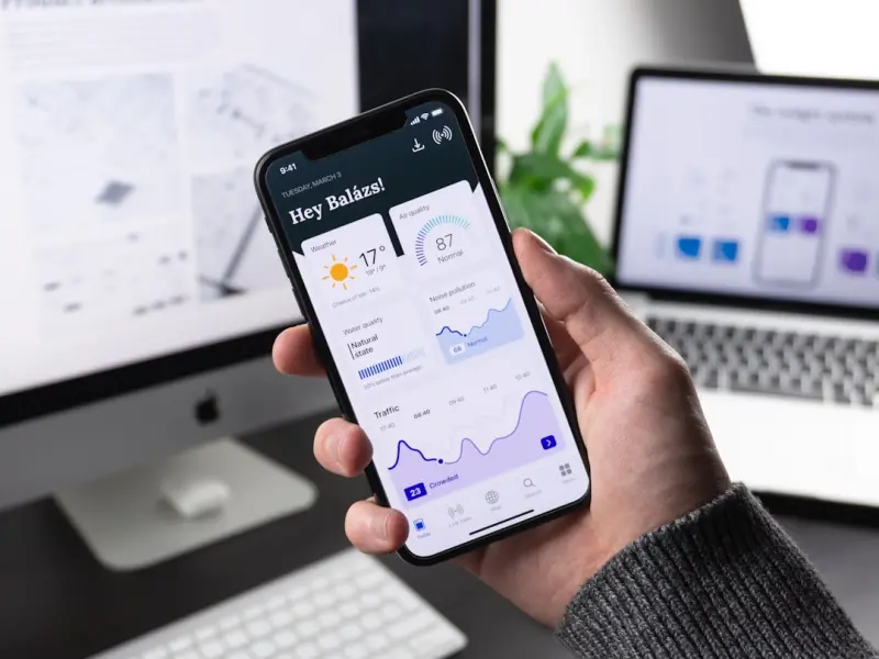
Deep Linking & Mobile SEO: Unlocking the Hidden Traffic Funnel for SaaS
Deep linking lets SaaS apps appear directly in mobile search results, bridging the gap between web a... Read More

The Future of Mobile SEO: Why It Matters More Than Ever
Mobile SEO is no longer a nicety, but a necessity. Learn how to optimize your website for mobile dev... Read More

Mobile SEO in 2024: Jessica Hall’s Insider Playbook for Dominating the Mobile SERPs
Jessica Hall shares her 2024 mobile SEO playbook, covering technical foundations, Core Web Vitals, l... Read More
Top Posts
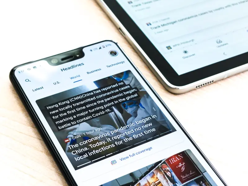
Mobile SEO in the Age of AI Snippets: Strategies for SaaS Leaders
Mobile SEO now demands AI‑crafted snippets, visual and voice optimization, and data‑driven iteration. This guide shows SaaS leaders how to turn mobile traff...Read More

Link Building in the Age of Interactive Experiences
Interactive assets like calculators, quizzes, and visualisations turn passive readers into active advocates, naturally generating high‑quality backlinks while...Read More

Research Partnerships: A Sustainable Link Building Playbook
This article explores a fresh link‑building approach: co‑creating research studies with complementary SaaS partners. Learn how to design, publish, and ampli...Read More

How Semantic Topic Mapping Can Future‑Proof Your Google SEO
Discover a fresh SEO approach: using semantic topic maps to align content with user intent, enhance Knowledge Graph signals, and stay ahead of Google’s evolvi...Read More
0 Comments
Post Comment
You will need to Login or Register to comment on this post!